Was my ticket booked?
The user is uncertain about the actual booking outcome.
The Tatkal clock · From uncertainty to clarity
Designing a clearer post-transaction experience so Tatkal users can understand their ticket, payment and refund status when a booking is interrupted.
02The problem
The user is uncertain about the actual booking outcome.
The user needs to understand what happened to the transaction.
The user must decide whether to wait, retry booking or track a refund.
ONE BOOKING. MULTIPLE SOURCES. NO CLEAR ANSWER.
IRCTC users booking Tatkal tickets may not know whether their ticket was booked or whether their payment went through when the booking is interrupted. Because booking, payment, and refund details are shown separately across different platforms or incompletely, users must check different sources and decide whether to wait, retry, or request a refund. This can cause stress, fear of duplicate charges, and the risk of losing the ticket opportunity.
03Research
Secondary research informed the research and discovery stage.
Users are very conscious of the limited booking time.
01Users prepare everything before Tatkal opens.
02Users are very conscious of the limited booking time.
03Users want to complete the booking as quickly as possible.
04Users experience slow loading during Tatkal.
05The app/website sometimes hangs.
06Some users get logged out.
07Some users have to restart the booking process.
08Seats can disappear while users are trying to complete booking.
09Users become worried when the system takes too long.
Users don't immediately know whether the ticket was booked.
Users check "My Bookings."
Users check their bank/UPI.
Users check SMS/email.
Users wait to see what happens.
Users try booking again.
Some users ask someone else what to do.
Users worry that retrying might result in duplicate payment.
Users worry that they will lose the available seat if they wait.
Users feel frustrated when there is no clear answer.
04Insights
Users can tolerate small delays during normal booking, but during Tatkal even a few minutes can mean losing the available ticket.
After making a payment, users want to immediately know whether their ticket is actually booked.
When the booking result is unclear, users don't know whether to wait or try booking again.
Users may check IRCTC, their bank/UPI app, SMS and email to understand what happened to one booking.
Login, authentication, system errors, payment and booking confirmation can all interrupt the Tatkal journey.
When something goes wrong, users need a clear explanation and a clear next step instead of simply seeing an error message.
05Ideation
How might we make sure that the failed payment status, ticket status and refund status are shown in a clear and understandable manner?
How might we make sure that the users are able to make a clear decision about re-booking the ticket based on the information of the previous booking outcome?
How might we give users enough certainty about their failed booking and refund status that they feel safe to re-book immediately?
MAKE THE NEXT STEP CLEAR.
06Before → After
Ticket status
Payment status
Refund initiation
Refund tracking
New booking
CURRENT EXPERIENCE
After a failed Tatkal booking, users may see no clear explanation that payment was deducted while the ticket was not booked. They must manually check Booked Ticket History, track the refund separately and restart the booking process.
PROPOSED REDESIGN
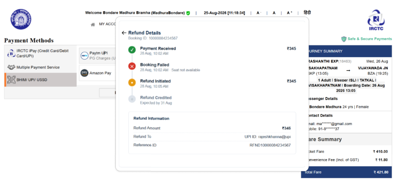
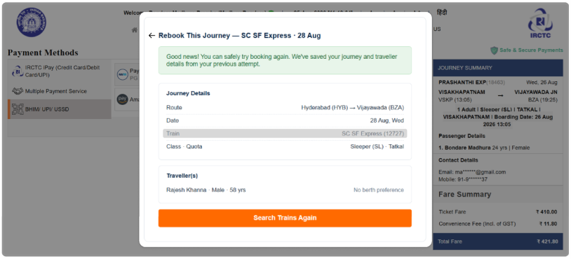
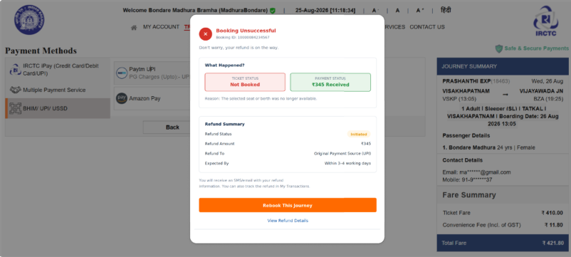
A clear transaction-result screen separates payment status from ticket status, confirms that the refund has been initiated, provides refund tracking information and gives the user a direct path to start a new booking for the same journey.
07Final solution
Proposed design screens from the hackathon. The amounts, dates and refund estimates shown belong to the original design artefacts; they are not live transactions or refund guarantees.
Ticket and payment status are shown separately. The refund summary and Rebook This Journey action appear in the same result.
The refund-details view connects payment, booking failure and refund status along one timeline.
The rebooking screen brings forward the previous journey and traveller details, with a direct Search Trains Again action.
08Reflection
A booking interruption is not just a technical failure. It creates uncertainty at a moment when users have very little time to make decisions.
The design direction focuses on making the transaction outcome understandable by bringing ticket status, payment status and refund information into a clearer experience.
WHEN A BOOKING IS INTERRUPTED, USERS SHOULDN'T HAVE TO GUESS WHAT HAPPENED NEXT.